Will The Quarantine Be The Death Of The Open Floor Plan?
Top architects and designers around the country predict how we’ll want our homes to live from now on.
Source: STEELE MARCOUX, VERANDA
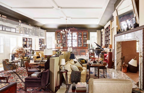
Not in recent memory have so many Americans carried out nearly every aspect of our lives—working, schooling, resting, playing, eating—at home. Spending so much time at home has meant we’ve had to rethink the way we use certain spaces, from setting up workspaces inside and out to popping up virtual happy hours from our living room sofas.
While many of these quick-fix design solutions are likely (and hopefully) temporary, there’s no doubt all of this time at home will change what we need from our homes—and thus how we want them designed—for the foreseeable future. One home design concept that may prove less desirable going forward: the open floor plan.
Used to describe homes in which two or more traditional-use rooms (like the kitchen, living room, and dining room) are combined to form a much larger space by eliminating walls that would have divided them, open floor plans have been the most popular residential architectural trend for new construction and renovation projects in the country since the 1990s. Their rise in popularity over time tracks in strikingly parallel fashion to the rise of the HGTV television network, which has made demolishing interior walls something of a spectator sport for homeowners and aspiring homeowners since it launched in 1994.
Widespread adoption of the open floor plan across the country reflects a significant change in the way we live compared with prior to the World Wars, particularly the shift to more casual lifestyles for families with children, and the reduced dependence on domestic staff.
“The biggest difference between old houses and new ones is the change where the kitchen is the center of the house and almost all daytime space revolves around the kitchen,” says James F. Carter, a Birmingham-based architect. In homes built prior to World War II, kitchens were positioned at the back of the house accessible by a center hallway or a back entrance for deliveries and staff.
Open floor plans where the kitchen acts as a kind of command central for home certainly offer conveniences to modern families. Fewer walls facilitates better traffic flow and more natural light throughout a home, and can make it easier for parents to monitor children. Furthermore, open floor plans offer a certain amount of flexibility, making it possible to reconfigure furniture arrangements as needs change.
But the open floor plan presents some serious design drawbacks, as well, such as a lack of privacy, poor sound control, and a cluttered appearance (despite regular tidying). And, as with nearly every imperfect aspect of our domestic lives, these weaknesses have been exposed and exacerbated during the quarantine like never before.
“Now more than ever having a room to escape to—the proverbial ‘room of one’s own—has taken on new meaning and greater significance,” says New York designer Charlotte Moss. “To be able to close a door, be free of noise, someone else’s conference call or video chat, just to be in your own space—your own head, if you will—this is a necessity. We all need physical separation to stay balanced.”
Architect Andrew Oyen of New York’s Ferguson & Shamamian reiterated the renewed value of distinct rooms during the quarantine, noting defined spaces can help provide structure and variety to endless time at home. “Rooms are important because they create a space for and celebrate specific activities,” Oyen says. “Now that we’re so contained, having unique spaces to experience particular functions enables variety to the routine.”
To find out how design can help resolve our intensifying need for privacy and variety at home, we interviewed top designers and architects across the country. Below, eight predictions for the future of American residential design.
The Return of the Dining Room – But Make It Multi-Purpose
The dining room—a discrete space for eating a meal and sharing meals with others—is a relatively recent development in the history of residential design. While there is evidence that ancient Greek and Roman civilizations had separate spaces for dining, the act of eating has taken place in large “great halls” throughout much of human history.
Although a handful of the most wealthy 18th century Americans had dining rooms in their homes—George Washington’s Mount Vernon and Thomas Jefferson’s Monticello, to name two colorful examples—it wasn’t until the 19th century that a dedicated room for dining was commonplace in American homes. (And it’s no coincidence that the silver cutlery industry blossomed at that time as well, turning out obscure silver pieces prized as collector’s items today.)
By the middle of the twentieth century, dining rooms were where many Americans invested most into the decoration of their home, furnishing them with chandeliers, large tables, and sideboards filled with their finest crystal, china, and silver. But the room—at least as we knew it during the twentieth century—has all but disappeared in homes across the country that boast open floor plans.
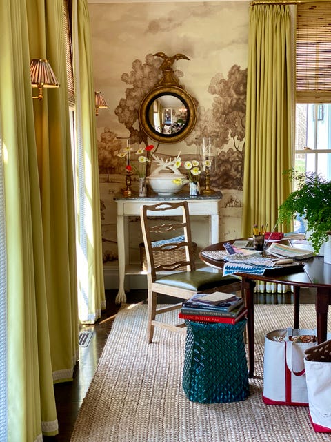
Those who do still have dedicated dining rooms may have a leg up on navigating home life during the quarantine as the space has proven itself an excellent spot to set up a temporary home office. And Moss is predicting their return.
“Maybe dining rooms will be used more in homes—wouldn’t that be a great outcome? Family meals at a table together rather than kitchen counters, coffee tables and laps. A room with a real bona fide purpose,” says Moss. “Personally, at the dinner table, I don’t want to see the destruction in the kitchen. How can you be relaxed and enjoy a nicely set table and a delicious meal if you are looking at debris? Not me, I do not function well with visual noise.”
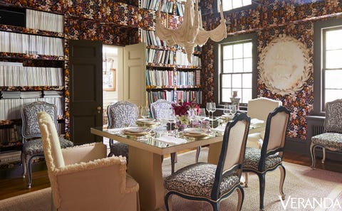
Toronto-based designer Colette van den Thillart agrees, underscoring the importance of using a home’s best room every day—even if that means assigning it more than one use. “I say let’s use the finest rooms every day, and for my family this meant making the dining room a library, a concept that has certainly come to fruition in these times as it has become a make shift library/art studio/office, and sometimes dining room!”
“It’s also a room that gives back,” adds van den Thillart about her Toronto dining room. “Those books are talismans of travels, friends, inspirations, imagination, and design ingenuity. In a time of isolation its very comforting to be surrounded by the ‘world’, my world, the world I curated over many years and many places in a way that means something to me…in words and pictures.”
New York and New Orleans-based designer Thomas Jayne defends the notion of a single-purpose room, citing writer Edith Wharton (and her book The Decoration of Houses) as his decoration North Star.
“Wharton was so interested in rooms, which was counter trend even back then. She wrote that it was ok to have single purpose rooms, that that’s not so decadent as it sounds,” Jayne says. As such, Jayne “always advise clients to have a dining room as a distinct space close to the kitchen,” he writes in his Classical Principles for Modern Design (Monacelli Press; 2018).
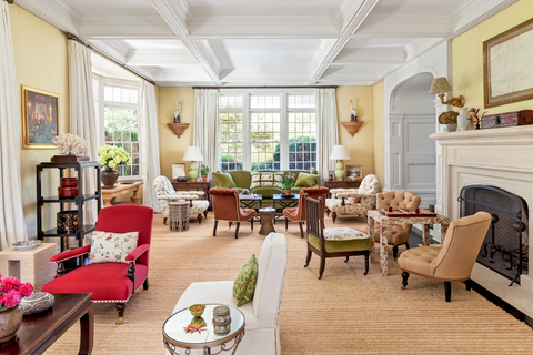
For those who don’t have space for a dedicated dining room, New Orleans-based designer Bill Brockschmidt of Brockschmidt & Coleman suggests furnishing other rooms with tables that can be used for dining.
“In my house in Sicily there is no designated dining room, but there is a table on each floor that can be opened and moved around depending on the season and occasion,” says Brockschmidt. “This makes it fun for us to dine in different settings, and having nice places to eat away from the kitchen makes meal planning and cooking more fun, too.”
Re-zoning Living Rooms With Parlor-Style Furniture Plans
The return of distinct rooms is not to suggest that large, open spaces won’t have a place in the future of home design. As any lover of old homes will tell you, the parlor—a room often at the front of the house where hosts received guests—may offer inspiration for modern living rooms as more people spend more time living and entertaining at home. But these spaces, which are typically rather large, can be challenging to furnish for those without deep design and decoration knowledge.
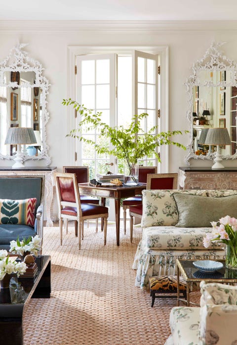
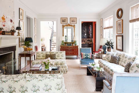
Birmingham-based interior designer Caroline Gidiere studies these turn of the twentieth century living spaces that were typically zoned into smaller conversation areas to help inform how to make the most of modern parlor-style living rooms.
“The furniture plan in my living room is one that France Elkins commonly used back in the thirties, when people really used their living rooms,” she says. “It’s devised to cater to small groupings of two or three, and to offer each an opportunity for private conversation—no need to speak up or yell across.
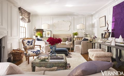
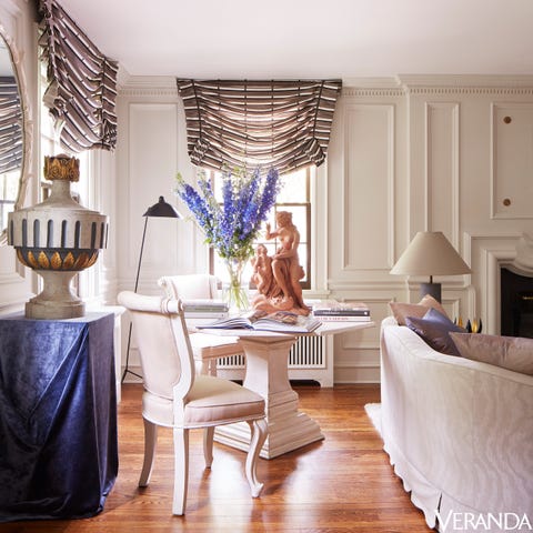
The living room at van den Thillart’s Toronto home is similarly set up. “While it’s not entirely ‘private,’ the room certainly allows for zones,” says the designer. “Then, depending on who is working on what we swap rooms and zones so we are all travelling the house a bit and getting a change of scenery.”

At the home he shares with designer Dan Fink in Bellport, New York, designer Thomas O’Brien uses a folding screen to create a partial division between seating areas.
“The half-screen, along with different carpets, allows us to create this intimate seating area in front of the fireplace, which is where we spend most of our time in this room,” says O’Brien. “It also cradles the desk on the other side, creating a little privacy for that area as well.”
New York-based designer Markham Roberts also sees potential for more partial divisions in large spaces. “For a client I just installed in an apartment with a great big open room, we used two double-sided bookcases to create a smaller cozy den separate from the larger area,” says Roberts. “Since the bookcases are only five feet high, they don’t cut the den off from the rest of the room, but they make an effective screen to give the smaller space a feeling of coziness.”
More Portable and Convertible Furniture
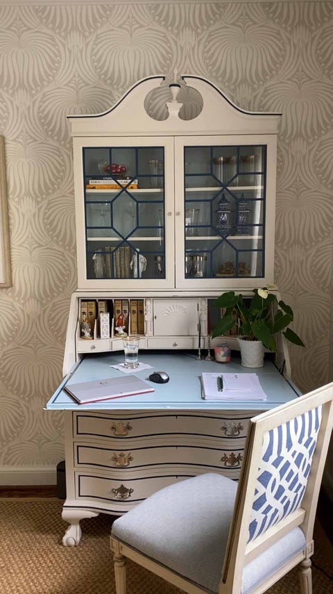
For large, parlor-style living rooms and smaller studies alike, designers are unanimous in predicting that portable furnishings, like occasional and drinks tables, and convertible pieces, such as folding game tables and secretary desks, will become more and more essential.
COURTESY OF MARIKA MEYER
“Pieces that are mean to be portable will become increasingly valuable,” designer Courtney Coleman, of Brockschmidt & Coleman, predicts. During the quarantine, Coleman has been “working at an antique games table that usually stays folded against a wall and only gets pulled out for card games and impromptu dinners,” much in the fashion of style icon Lee Radziwill, who would often set up a card table by the fireplace in her all white living room.
“Likewise, a very minor piece of furniture that has become very important is a little Moorish style table that gets moved around from balcony to courtyard for lunches and then drinks in the evening,” adds Coleman.
The demand for secretary desks, or other pieces with a close-able, hinged desktop surface, are likely to increase in demand as well. “If there’s not a dedicated work room with a door, it’s nice to have a closeable desk with a cabinet and some empty drawers nearby,” says Brockschmidt. “An antique secretary is beautiful and functional if a laptop or computer monitor can fit within.”
Tucked-In Kitchens That Connect To Living Rooms
So how can we break the kitchen off from the living room, to avoid that over-used and yet under-utilized “great room” phenomenon? Architects across the country are looking to traditional design devices like lower ceilings and cased openings for solutions.
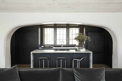
“In my own house, space was at a premium so I did want a “one-room answer” to dining and living—but I also wanted to have my kitchen close by, of course,” says Birmingham, AL-based architect Jeffrey Dungan.
“To solve the run-on-sentence of design where it just becomes a bowling alley or has a warehouse feel, I tucked the kitchen into a lower ceiling and separated it with a very broad and thickened arch. This created a space that feels very open, visually, but also offered a separation of the kitchen’s activity from the entertaining area.”
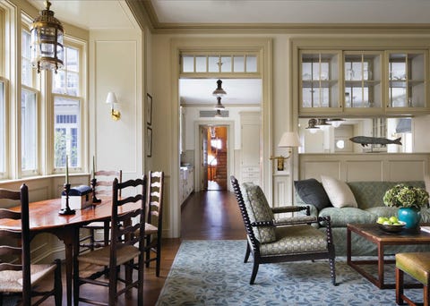
Ferguson & Shamamian’s Oyen agreed, noting that architectural details like beams and molding can “imply a separation without really creating one, which keeps rooms from feeling endless or poorly proportioned.”
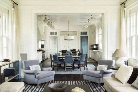
Specifically for kitchens, he proposes defining a little separation with architectural devices like double-sided glass cabinets and large cased openings to “create a separation between an otherwise ‘connected’ kitchen and a great room or family room,” says Oyen.
LISA ROMEREIN
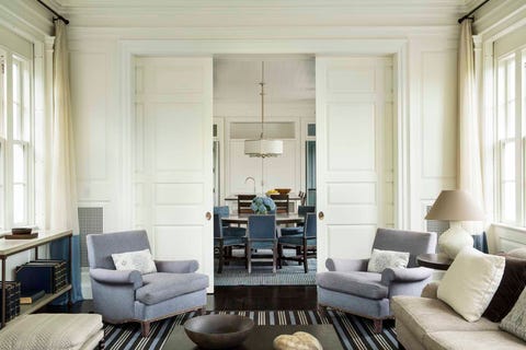
“Large pocket doors also give flexibility,” adds Brockschmidt. “We are working on a project where the kitchen opens to the dining room. We’re adding grand pocket doors so that the kitchen visually expands into the elegant dining room on a daily basis, but can be easily and elegantly closed off for more formal entertaining.”
More Bay Windows, Alcoves & Nooks
The utility of creating subtle architectural separation via changing ceiling heights and bay window bump-outs extends beyond the kitchen.
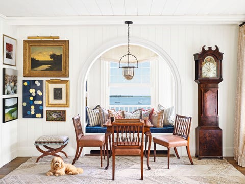
“Changing ceiling heights in an open space can help to break up large rooms. For example, a lower ceiling height in one area can create an alcove that immediately suggests a place for a different activity than the that of the adjacent, larger space,” says Oyen.
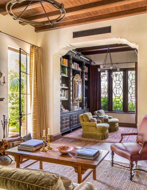
“Niches and alcoves, which are both part of a space and separate at the same time, often create places like libraries or studies for specific activities while remaining connected to the rooms they serve.”
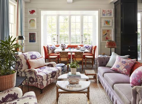
Gidiere extolls the virtue of a bay window, particularly for how it provides a moment of respite or pause within a hub of activity, like a kitchen or family room, at home.
“A bay window is alluring because it gives you three things at once: gorgeous light, a tremendous view, and extra space,” says Gidiere. “When you couple with a banquette, which is created with comfort in mind, the space truly invites us to slow down and to stay a while. We need places for quite respite throughout our homes to feed those moments in our busy lives.”
“And, by eliminating the need for a 3’ perimeter on all four sides normally required for a dining table, you can literally squeeze in a dedicated dining space where it otherwise would have been unthinkable.”
Smaller Master Bedrooms, With Adjacent, Specific-Use Spaces
Nowhere is the alcove a more useful device than in a the master bedroom, which designers are predicting will become smaller as more Americans seek to partition off valuable square footage for other, more specific uses.
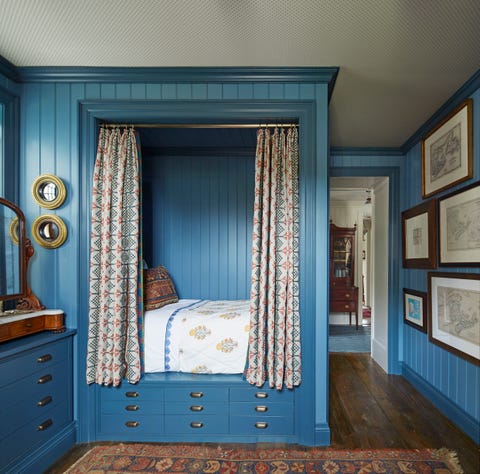
“Large rooms are all too often just big and undistinguished, particularly master bedrooms,” says Brockschmidt. “There are many master bedrooms that seem empty without a seating area, but that space often ends up not being used. That square footage might be better as a separate connected dressing room, sitting room, or study alcove.
Plus, more rooms mean more colors,” adds Brockschmidt. “I love when a house has a blue room and a green room and a yellow room and that’s how they are referred to. In these times when we are spending so much time at home, it’s nice to experience some variety.
More Upholstered Rooms For Coziness
Those adjacent alcoves, as well as other small rooms like home offices, make wonderful opportunities for upholstered walls, which not only beckon with coziness but also provide a degree of noise buffering.
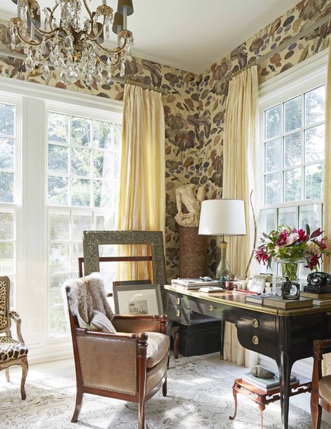
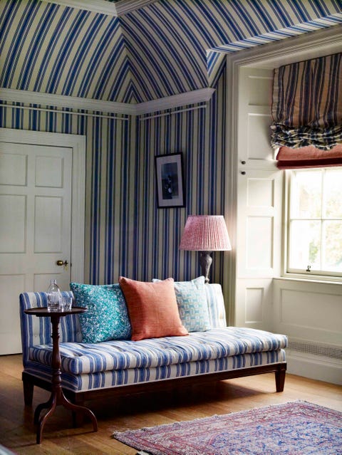
“Tenting” a room—covering all surfaces of a space with fabric—is “cocooning at its best,” says interior designer Alessandra Branca. “They invoke the illusion of more interesting architecture simply by creating the look of a pitched ceiling, and provide a beautiful opportunity for escape.”
Garden Access—And Views—Everywhere
Another way to create a sense of escape at home is via connection to the outdoors, which Brockschmidt concedes has never been more important.
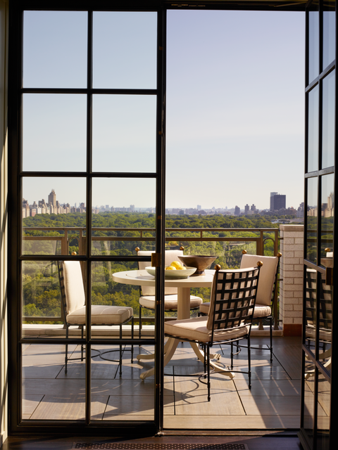
“The importance of a connection to the outdoors—even a small one—in these stay-at-home days cannot be underestimated,” says Brockschmidt. “Even a Juliet balcony is an opportunity to experience the outdoors from head-to-toe in an otherwise interior space.”
Coleman, his business partner, agrees. “I’ve been thinking about how David Easton always considered architecture, landscape, and decorating as inseparable. When he designed a room, he was as focused on the views from the windows as he was on the furniture or wall finishes. He made sure that the landscape was an extension of the interior and that it contributed to the setting.”
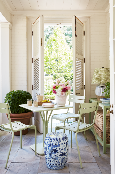
For those who have space for yards or gardens, multiple access points to smaller, more defined “outdoor rooms” with variety of experiences may become preferable to a single large yard.
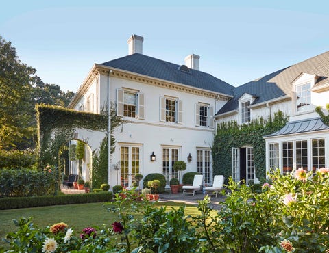
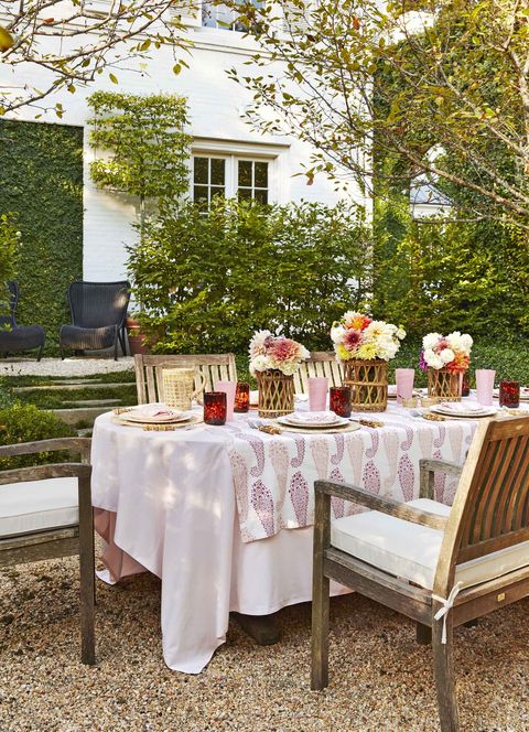
“We have seven different access points to the gardens around our house, and five, or possibly six, different garden areas,” notes Gidiere. “These garden rooms more than double the space of our 4,500 square foot house during temperate weather, and that really keeps us from feeling trapped under one roof.”

 USA
USA 


 © Jackson Lieblein, LLC 2015.
